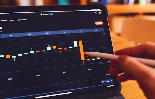
Crypto markets are known for their volatility, and learning to read crypto charts is a key skill for any investor. Whatever your trading strategy, crypto technical analysis can help you make informed decisions.
Let’s break down the basics of crypto charts for investing, focusing on Candlestick Charts, their key indicators, and how to spot trading opportunities\! As always, this is not financial advice; always do your own research before investing.
Types of Crypto Trading Charts
When analyzing price movements, traders use different types of charts to visualize trends. Here are the three most common chart types in crypto technical analysis:
- Line Chart - A line chart is the simplest, only showing the closing prices for an asset or market over time. It’s an excellent way for beginners to understand trends quickly. They’re best for long-term investments rather than short-term trading.
- Bar Chart - Each bar in this chart type represents open, high, low, and close (OHLC) prices for a given timeframe. They’re useful for spotting price ranges and volatility and are often used by traders who want more detail than a line chart but without the complexity of candlesticks.
- Candlestick Chart (Most Popular) - Each candlestick provides open, close, high, and low prices, making it ideal for in-depth analysis. They are widely used in crypto investing because they show trends, reversals, and market sentiment. Traders rely on candlestick patterns (e.g., Doji, Hammer, Engulfing) for trade signals and can use other forms of data points on top to conduct deeper analysis.
Let’s dive deeper into how to read crypto candlestick charts and use them for decision-making.
Understanding Candlestick Charts
The candlestick chart is one of the most commonly used tools for analyzing price action in the crypto market. Each candlestick represents a specific time period (1 minute, 1 hour, 1 day, etc.) and provides four key data points:
- Open Price - The price at the beginning of the selected timeframe.
- Close Price - The price at the end of the selected time frame.
- High Price - The highest price reached in that period.
- Low Price - The lowest price reached in that period.
It creates a pattern that looks like this:

How to Read Candlesticks:
As you can see, each candle also has a body and a wick (shadow). Here’s what they indicate:
- Green (or white) candlesticks: Price closed higher than it opened (bullish)
- Red (or black) candlesticks: Price closed lower than it opened (bearish)
- Long wicks: Indicate price rejection (a sudden reversal) at a certain level
- Small bodies with long wicks: Signal market indecision
Further Analysis with Candlestick Charts:
While the candlesticks alone can offer valuable information, analysts will overlay other data points to gain more information from the chart, such as Moving Averages, Relative Strength Indexes, and Bollinger Bands, to understand market movements better.
Moving Averages (MA)
Moving Averages smooth out price data to highlight trends. A Simple Moving Average (SMA) calculates the average price over a period.
- If the price is above the MA, the asset is in an uptrend—A potential buying opportunity.
- If the price is below the MA, the asset is in a downtrend—Consider holding or selling.
Relative Strength Index (RSI)
RSI demonstrates overbought and oversold measures via price momentum from 0 to 100\. If the RSI is over 70, the stock is overbought and may indicate a price drop is coming. An RSI below 30 means the asset is oversold and may rise in price soon.
- RSI above 70—Consider waiting before buying (the asset might correct).
- RSI below 30—A potential buying opportunity if supported by other indicators.
Bollinger Bands
Bollinger Bands identify volatility and breakouts in the market. They consist of a middle SMA and an upper and lower band that expand and contract depending on the market volatility. If the price is near your upper band, the asset might be overbought and about to drop. If the price is near the lower band, the asset may be oversold and could be on the up soon.
- If the bands are wide, the market may be more volatile.
- If the bands are narrow, the market may be more stable.
Candlestick Charts & Rebalancing
Rebalancing and candlestick chart analysis can work together to create a strategic, data-driven approach to managing your crypto portfolio. While rebalancing ensures that your portfolio remains aligned with your long-term goals and risk tolerance, candlestick chart analysis helps you make well-timed decisions on when and how to rebalance. By checking price trends before adjusting allocations, you ensure that your moves align with both long-term portfolio stability and short-term market conditions.
Learning to read crypto charts is a powerful skill that will help you navigate market volatility. Whether you're looking for short-term trading opportunities or long-term investments, understanding crypto technical analysis, candlestick charts, and key indicators will give you an edge—especially if you pair it with a healthy rebalancing strategy.

